[Top][All Lists]
[Date Prev][Date Next][Thread Prev][Thread Next][Date Index][Thread Index]
[Gnumed-devel] Usability ?a matter of taste
|
From: |
Richard Terry |
|
Subject: |
[Gnumed-devel] Usability ?a matter of taste |
|
Date: |
Sun, 13 Mar 2005 19:50:34 +1100 |
|
User-agent: |
KMail/1.5.4 |
Yes and No. Please read all the text before looking at the pngs for they will
not be self explanatory.
A good analogy is anyone driving an old ford may think its the bees knees.
After all it gets you from A to B. Give them a porche, and let them compare.
Good software design is both about backend engineering and the ergonomics and
functionality of the work flow offered by the front-end.
As someone else mentioned in a previous post, we have had 10 years +
experience in clinical software in this country, and I have had the
opportunity over many years, initially in my role as IT manager for the HUDGP
+ project software writer for divisional projects + implementation in my
office, to see the huge difference in functionality of different products.
When I wrote my initial script writing software - it was just that - script
writing. We used it in a dozen practices as part of a project, and I
continued to support it for several years later until I had to forcibly
wrench it out of the computers as I no longer wanted to run around and do the
drug updates etc.
To this day, those users, most of whom use medical director or MedTech (NZ)
bemoan the fact that they had to stop using it. Fellow GP's who have
subsequently sat and played with my software can immediately see how good it
is - mainly because of the speed and method of the work flow.
This is a concept that I think many people on this development team still do
not understand - ie that one has to define functionality/user need. It is no
good person A coming up with what they think will be a good design for
something if it a) doesn't work in practice and b) dosn't fit into an overall
design philosophy. Countless hours are then put into something which may not
be easy to change.
The SOAP editor is yet another example of a good concept which currently is
being implemented in an unworkable fashion - yet most of you will never ever
know this, even after you start to use it on your desktop, because you will
not have been able to experience an integrated alternative.
Lest you forget, the SOAP editor was written by Ian with my design specs, at
my request. Carlos or Karsten (Carlos I think) came up with the fabulous idea
of having multiple SOAP controls in the workspace. Now instead of the group
running with that idea and optimizing it before its development became
intrenched - that is were it sat, and is now the preferred production model
using an essentially unworkable, unergonomic, multi-sash control that will do
nothing but confuse the user, and should be replaced by the much more elegant
notebook tab control which is easy to use/add/delete tabs.
I've taken Carlos's code and started substituting a tab control there, just to
see what it looks like, and I enclose some pngs, but I don't have the ability
to make it work.
To try and explain why the multi-sash concept becomes unworkable, I've entered
a few consultations, which are not untypical of what one sees in general
practice - where many many of our consults are not one liners. I've kept
the size of the multiple soap at something reasonable given that it will
probably shouldn't occupy the whole of the screen.
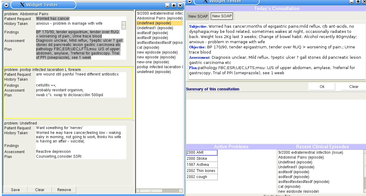
Note particularly that one very rapidly loses multiple lines of the
consultation notes from view because of the confines of space. Where the
scrollbars are, was about 4-5 lines of history notes (probably the most
important part of the consult) and that it is no longer visible.
Next I've put up a png with Carlos's code + a tab instead of a multi-sash
(havn't figured out how to pass the SOAP to the tab). Adding a new tab BTW is
a simple one liner tab.AddPage(control). Notice in this png, that the design
includes both the active history list, recent consultation list, and summary
of the current consultation list.
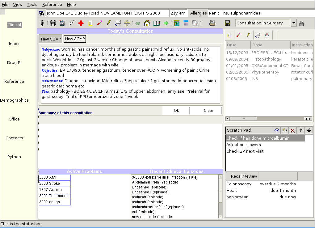
Lastly I've cut and pasted the amalgam of the multi-tabbed soap + list of
recent encounters + active problem list, into wxPython25 design to show how
much more reable/useable the multi-tabbed SOAP design would be when one can
allow larger screen area than is possible with multi-sash to the soap
control , and also how the whole concepts fits into the large picture of the
patient record.
Regards
Richard
On Sun, 13 Mar 2005 12:02 pm, Karsten Hilbert wrote:
> On Sun, Mar 13, 2005 at 10:34:13AM +1100, Syan Tan wrote:
> > Q. is usability a matter of taste?
>
> I would think yes.
>
> Karsten
 carlos_multisash_vs_tabbed.png
Description: PNG image
carlos_tabbed_incontext.png
Description: PNG image
- [Gnumed-devel] Gui - not just a pretty face, E Dodd, 2005/03/12
- Re: [Gnumed-devel] Gui - not just a pretty face, Richard Terry, 2005/03/13
- Re: [Gnumed-devel] Gui - not just a pretty face, J Busser, 2005/03/14
- Re: [Gnumed-devel] Gui - not just a pretty face, Karsten Hilbert, 2005/03/14
- Re: [Gnumed-devel] Gui - not just a pretty face, Ian Haywood, 2005/03/14
- Re: [Gnumed-devel] Gui - not just a pretty face, Sebastian Hilbert, 2005/03/14
- Re: [Gnumed-devel] Gui - not just a pretty face, J Busser, 2005/03/14
- Re: [Gnumed-devel] Gui - not just a pretty face, Karsten Hilbert, 2005/03/14