[Date Prev][Date Next][Thread Prev][Thread Next][Date Index][Thread Index]
Re: [Gnumed-devel] Intensity of colour shading of high or low measuremen
|
From: |
Karsten Hilbert |
|
Subject: |
Re: [Gnumed-devel] Intensity of colour shading of high or low measurements |
|
Date: |
Sat, 28 Jun 2014 20:09:51 +0200 |
|
User-agent: |
Mutt/1.5.23 (2014-03-12) |
On Sat, Jun 28, 2014 at 05:36:47PM +0000, Jim Busser wrote:
> > Currently it is "cornflower blue". Please suggest a better
> > alternative.
>
> Hmm … a few options avail at http://www.html-color-names.com/color-chart.php
> including
>
> - LightSkyBlue
> - Cyan
> - PaleTurquoise
>
> some thoughts:
>
> 1) LightSkyBlue is a tad lighter
>
> 2) Cyan gives good contrast from black text. But is it so over-powering as to
> distract from other measurements?
>
> 3) PaleTurquoise offers good contrast, and is least visually distracting. But
> is it so faint as to provide insufficient contrast?
>
> My guess would be to look at PaleTurquoise and, if you deem its contrast
> insufficient, we maybe try LightSkyBlue?
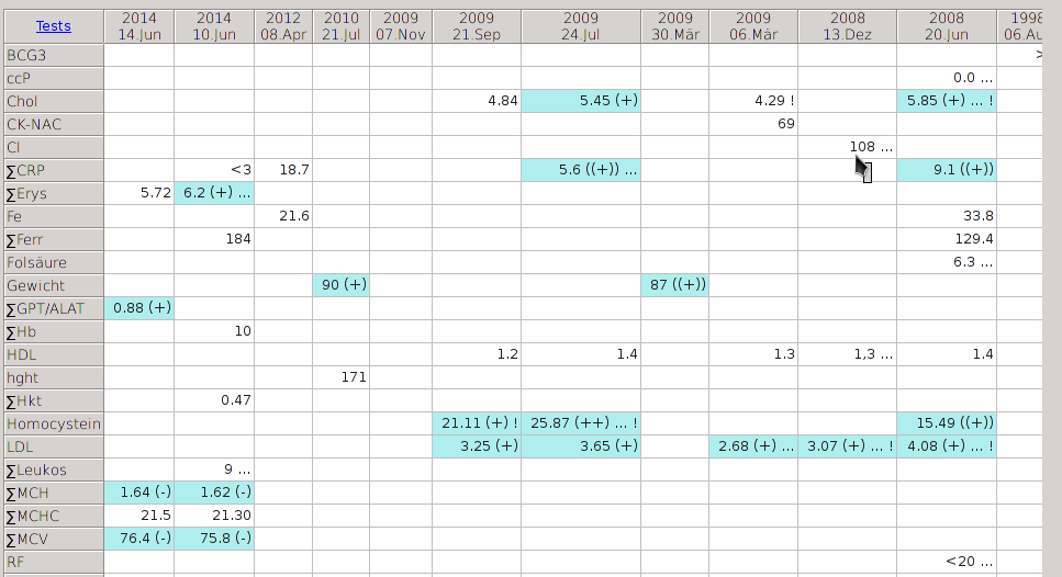
PALE TURQUOISE works for me. Actually, it feels quite, well, "friendly".
Karsten
--
GPG key ID E4071346 @ gpg-keyserver.de
E167 67FD A291 2BEA 73BD 4537 78B9 A9F9 E407 1346
 screenshot_001.png
Description: PNG image