Hi,
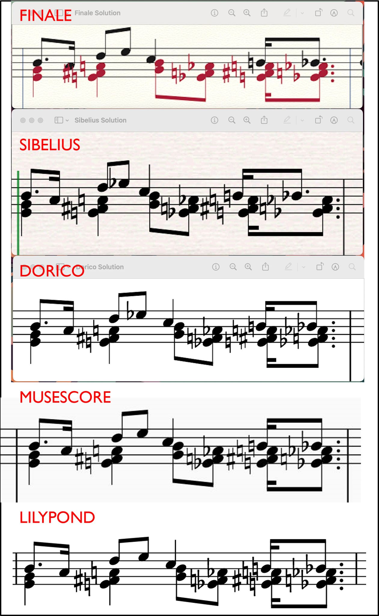
In the Facebook "Music Engraving Tips" group (great group by the way, recommended!) someone posted a comparison of the default output, without tweakings and adjustments, of a tricky fragment of music using Finale, Sibelius, and Dorico. Soon someone else added versions from free alternatives MuseScore and LilyPond.
As you can see in the attached picture LilyPond does a great job compared to the commercial competitors!
A good example showing LilyPond's strength.
The comparison also shows something that looks a bit ugly (according to some people, and I tend to agree): the design of the natural sign. Are there more people here who think the hole in the middle of the natural sign is too large and doesn't fit nicely on/between the stafflines? Is there room for improvement here? Let's discuss.
See attached picture.
MT