Description: image/svg
|
| From: | bojo42 |
| Subject: | Re: redone SVG desktop logo |
| Date: | Sun, 05 Feb 2012 18:03:04 +0100 |
Okay thanks for the insight, i didn't know it was mainly for the "About"
dialog. Maybe it would be good idea to ship a seperate one for the
desktop icons. I think the main resolution for the FDO spec is 48x48,
but it seems that GNOME3 tends to use a SVG if shipped in
"/usr/share/icons/hicolor/scalable/apps/".
In the Debian packaging i therefore copy the SVG and export it to 48x48
and 64x64 PNGs via "rsvg-convert -a -w WIDTH -h HEIGHT ...". The 16x16
is shipped as well.
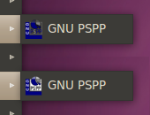
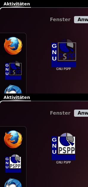
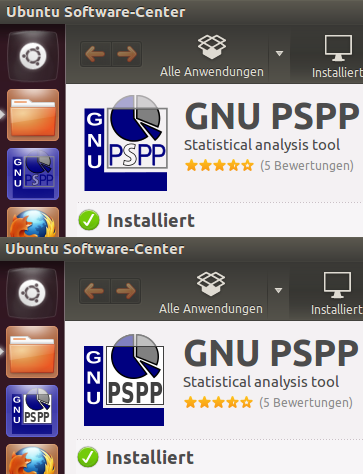
About your screen you're right. But the use case i care right now about
as a packager is the default look the user gets presented when trying to
install and start the program. To show you that i did some comparing
screenshots under current "GNOME" desktop default setups (that's under
Ubuntu, but it should be mostly valid for stock Debian setups). I also
lowered the brightness of the top element, therefore i reattached the
current version of the used icon, although it's still missing the font
changes you currently did.
Cheers
Am Samstag, den 04.02.2012, 15:45 +0000 schrieb John Darrington:
> This logo was never intended (at least not originally) to be a desktop
> icon. Application icons are in the directory src/ui/gui/app-icons
> Currently there is only one 16x16 icon there, and it is far from beautiful.
> However this is what get's installed in the gnome icon directory and gets
> used by default.
>
> Pspplogo.{svg,png} is intended to be used only in the About dialog. (click
> Help|About or Hilfe|Info in a de locale). Maybe we're seeing different
> results due to differing theme engines, screen hardware etc, but I thought
> your mailed logo looked rather fuzzy in that screen.
> I'm attaching an xmag capture of the two so that you can see what I mean.
> Mine has fewer anti-aliasing artifacts, and appears "crisper" - at least
> that's my opinion.
>
> You're right about the readability in small icons. For this reason it is
> often necessary to create a whole set of icons to cover each resolution.
> Would you like to have a go at producing such a set? We would need icons
> at 16x16, 22x22, 24x24, 32x32, 48x48 and 64x64
>
> J'
>
> On Sat, Feb 04, 2012 at 03:31:17PM +0100, bojo42 wrote:
> Hmmm, sorry i am not quite happy with the new SVG in Git, as i also
> rescale it to 48x48 in Inkscape, since all other GNOME icons seems to be
> made for that, because it scales better to 48x48 and 64x64. I also
> rearranged the objects a bit and converted the alpha background of the
> rectangle to white (like in the website logo and for better contrast).
>
> So it would be nice if you can review the mailed SVG a bit more in
> detail and maybe rebase the font changes on that one. On a side note i
> think the white "S" is good for a similar look to the splash, but
> probably not the best for readability in small desktop icons.
>
>
![]() pspp.svg
pspp.svg
Description: image/svg
![]() GNOME2.png
GNOME2.png
Description: PNG image
![]() GNOME_Shell.png
GNOME_Shell.png
Description: PNG image
![]() Unity&USC.png
Unity&USC.png
Description: PNG image
| [Prev in Thread] | Current Thread | [Next in Thread] |