Description: PNG image
|
| From: | richard terry |
| Subject: | Re: [Gnumed-devel] another icon request/proposal |
| Date: | Fri, 4 Apr 2003 09:51:12 +1000 |
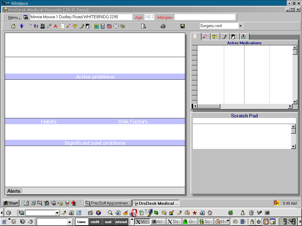
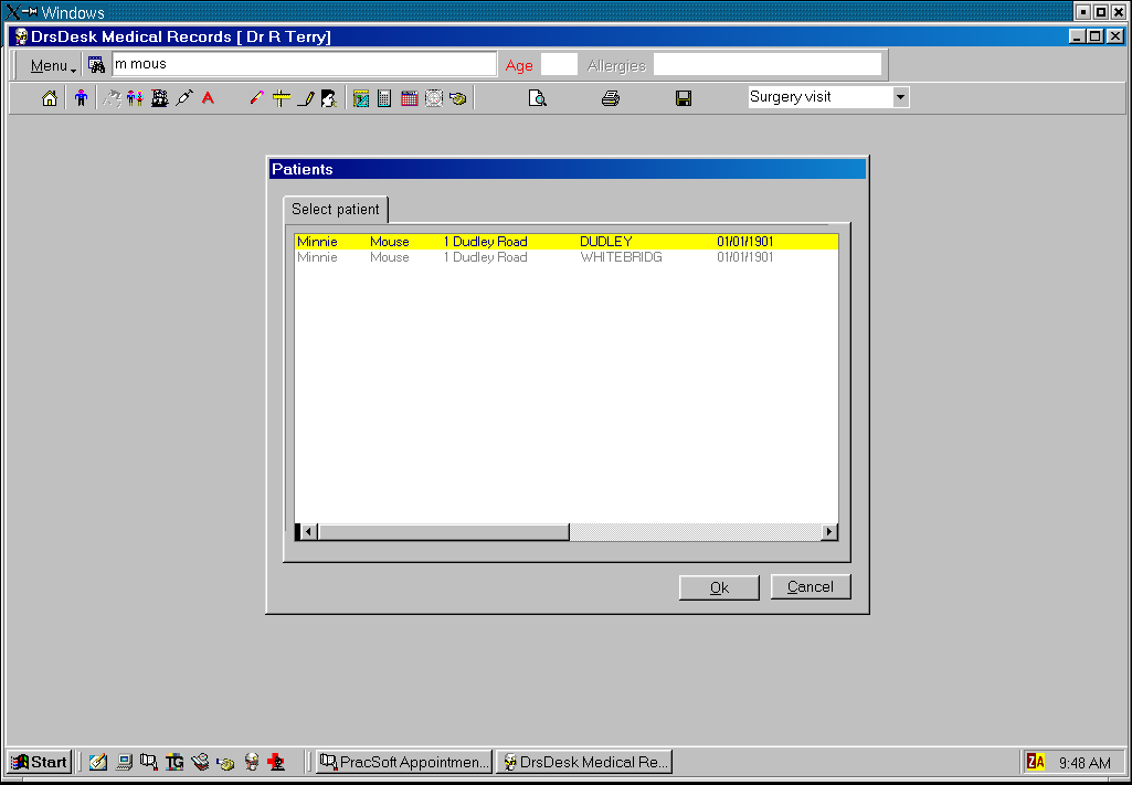
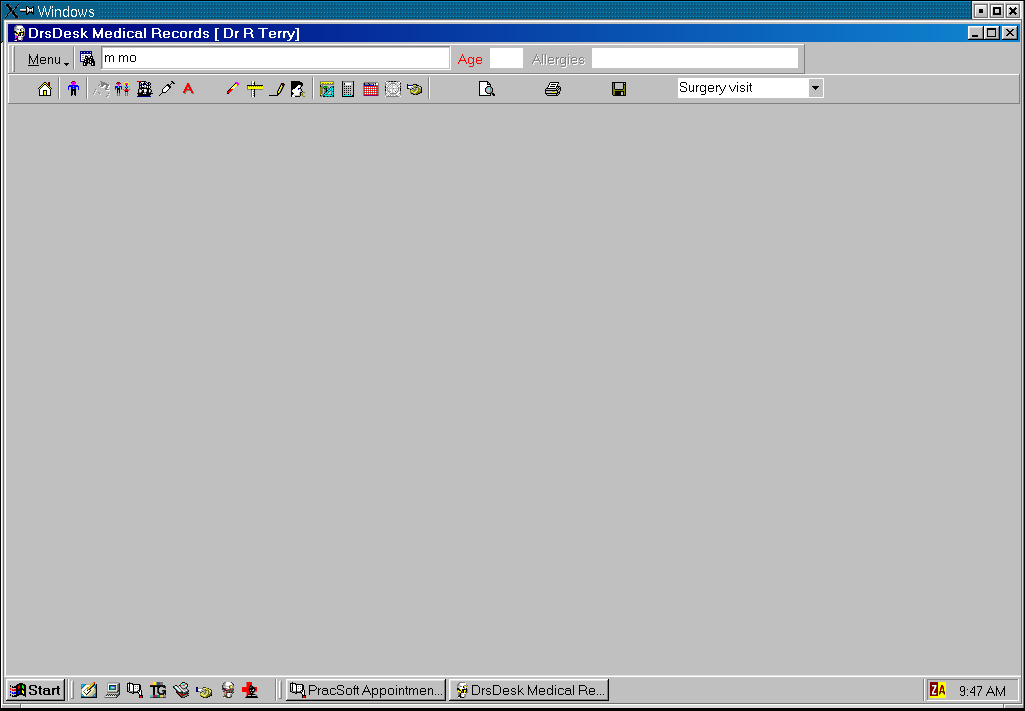
*********************************************************************
Karsten I don't agree with your interpretation of this icon's function and
beleive a magnifier to be entirely the wrong concept for reasons given below:
*********************************************************************
In My role as gui-co-ordinator I'd make the following comments and please
check out the three sequential screen dumps below

-Great Icon Yeah, I knicked it out of Access7.0 (oops, should I say that on a
public list)

-It is not meant to sit on an active button.It is meant to be a visual
indicator equivalent to having a label 'find patient' which would take up too
much space as screen real-estate is always at a premium.

-ie the binoculars =find, the background=in the database.
-it should still be there, I think it is very appropriate, but should not be
on a clickable button.

NOTE::

In terms of functionality this is how I beleive the find patient wigit should
behave:
-at bootup there is nothing in the wigit.

-when the user clicks on the wigit and enters text the search is triggered by
one and one way only - hitting the enter key (+if desired a user defined
function key), but certainly NOT any other events such as lost focus.

-if a single patient is found then their entire name and address is placed in
the box/combo (see png below)

-if multiple patients are found a MODAL box pops up with the list (centred
BTW in the middle of the gnumed main window and large enough to display all
the multiple names and addresses

Now, when the doctor has finished dealing with the patient the very act of
clicking on the wigit again (which at this point contains a name) triggers a
'got focus' event.

This event a)checks that all information has been saved, forms printed etc
and if not prompts user to do that, then clears the wigit window and sets the
cursor at the start of the line.

This works extremely well. I've done it for years in my program.

In gnumed I would add the following functionality which is missing from my
program (I didn't think to do it, but it is needed).

As part of the got focus event for the patient search wigit - the patients
ID, name address etc is added to the drop down combo box which is the patient
search wigit. One would keep say, the last 10 (n=doctor defined) patients in
this list.

If in the middle of doing something for one patient, you need to swap to
another patient, then one can select from this dropdown list which then
replaces the internal datasets with data from the appropriate patient.


Regards

Richard

On Friday 04 April 2003 1:43 am, you wrote:
> I am in the process of reworking the top pane of the main
> GnuMed screen to include the new patient search widget. It
> occurred to me that the button icon for "demograpics details"
> is not really intuitive (at least to me). It shows a form
> partially covered by binoculars. Now, I do like the quality of
> the icon - it really looks professional. However, I'd propose
> to change the binoculars into a magnifying glass.
>
> Or does someone have an even better suggestion ?
>
> The icon should convey the meaning
>  "go display the (demographic) details for this patient"
> where "this" refers to the patient in the adjacent search
> widget virtue of it's spatial proximity.
>
> Thanks,
> Karsten
![]() search3.png
search3.png
Description: PNG image
![]() search2.png
search2.png
Description: PNG image
![]() search1.png
search1.png
Description: PNG image
| [Prev in Thread] | Current Thread | [Next in Thread] |