[Date Prev][Date Next][Thread Prev][Thread Next][Date Index][Thread Index]
Re: Fonts looking washed out with newer freetype versions
|
From: |
mcxds |
|
Subject: |
Re: Fonts looking washed out with newer freetype versions |
|
Date: |
Tue, 2 Mar 2021 17:34:25 +0100 |
>
>> I experience fonts rendered with the newer versions of FreeType as
>> looking pale/'washed out' and somehow blurrier on my low DPI screens
>> compared to their rendering with FreeType version 2.6.1 (with
>> FT_CONFIG_OPTION_SUBPIXEL_RENDERING enabled).
>
> This is far too vague. Please send comparison images together with
> the necessary details (which font, which DPI, which point size, etc.).
>
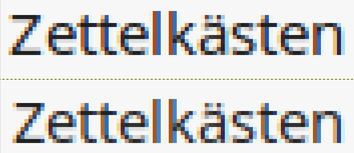
I have attached two images. The first one shows some text in an Emacs
buffer. The font is DejaVu Sans Regular at 14pt. The upper text is
rendered with FreeType 2.6.1, the lower text with FreeType 2.10.1. The
second image shows a text string in Thunar file manager scaled up by
800%. The font is Noto Sans Regular at 11pt. The upper string is
rendered with FreeType 2.6.1, the lower one with 2.10.1.
DPI is set to 96 in Xfce-Settings, actual monitor DPI being 93,78.
Operating systems are Linux Mint 18.3 Xfce (coming with FreeType 2.6.1)
and Linux Mint 20.1 Xfce (coming with FreeType 2.10.1).
I'll happily provide more information/images if necessary.
Peter
 Image1.png
Description: PNG image
Image2.png
Description: PNG image
- Re: Fonts looking washed out with newer freetype versions,
mcxds <=