On Mon, 13 Apr 2020 at 14:17, Christian Grothoff <
address@hidden> wrote:
On 4/13/20 2:37 PM, belen barros pena wrote:
>
>
>
> On Fri, 10 Apr 2020 at 17:20, Torsten Grote <address@hidden
> <mailto:address@hidden>> wrote:
>
> I should probably put a mockup together so that you can actually see
> what I mean: I'll try to do that.
>
>
> I've attached a quick mock up. Let me know what you think.
I generally like it, but there are details missing that we do have in
the existing implementation (which right now fails for me, but that's
another story). I'm not sure this is because you made a "quick" mock up,
or because you forgot, so please let's discuss:
Yes: sorry. It was a very quick thing. Commenting the whole mockup in full detail would take me time I don't have :(
i) I assume you intended the grey circles to be replaced with
iconography indicative of withdraw/payment/refund/tip/etc., if not, I
would want to know why not.
Yes: the grey circles on the left of the list items are supposed to be icons. Those icons indicate the transaction type, like you are doing at the moment.
Our existing implementation shows an icon
AND text ("withdraw", "payment"). We could leave out the text and put
the date there (as you have in your code), or put the text under the
icon. What do you think?
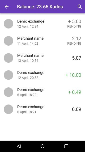
I am trying to simplify: design is mostly about that :) Right now, for each transaction your design shows the following;
1. Transaction type icon
2. Transaction description
3. Transaction type
4. Time stamp
5. Amount
6. Fee
This is way too much. For each of those items, I asked: is it really needed in this screen? And I took away the items when the answer was: no, not really. I've left the following:
1. Trasaction type icon: this is the main way we communicate the transaction type, so we can remove the transaction type string.
2. Transaction description: we will need to specify what this will be for each transaction type. For instance, a merchant name, or a exchange name, etc
3. Time stamp
4. Amount: this the final amount for the transaction and takes into account the fees charged. So for a withdrawal of 10.00 with a fee of 0.20 the amount we show is 9.80. That's what matters at this point, because that's the amount that went into the balance, and the purpose of this screen is to show you how your balance has come be the amount it is. The full transaction breakdown, including the fees, can go into the transaction details screen: still easily accessible, but not cluttering the transaction list.
ii) Also, we are currently showing 'recent' events using relative time
("5 minutes ago"), while you always show the absolute time (12 April),
which implies still that you'd shorten it for the current year.
Yes. The assumption is that most of the time you will be looking at this year's transactions. We would need to display the year for transactions that didn't happen this year (e.g. 15 Apr 2019)
What do
people think is better?
This is a personal preference: I like absolute times because they are unequivocal and do not rely on me having the contextual information required to interpret them. But I have no evidence they are better or worse than relative time. If you prefer relative time, go for it. But since I was doing the mock up, I picked the time I like the most ;)
Please also consider the (iii) and 1-5
time-based structure we might add when thinking about how to represent
the date.
Dates and times are such a pain :) In an ideal world we would use the same time format the phone uses (in my case, dd/mm/yyyy and 24-hour time).
iii) In the title bar, I would still want to see a 'search' icon (to
give users a hint that they CAN search). I assume you 'forgot'.
I completely forgot. I've added it (see attached).
iv) I'm not so sure about the sorting: you have pending on top, except
that this breaks sorting by date. Kind-of OK, but I think we need a good
way to navigate by date (see below). Then again, your design goes back
to an earlier proposal that I had put forward to a view that combines
pending and history. IIRC Florian didn't like it, maybe he should argue
about it here?
We could also keep the sorting, and just place the pending transactions in their corresponding position. Most of the time they will be very close to the top anyway, so that may also work. Alternatively, we could add a heading to separate the pending from the completed transactions, but I rather avoid that if possible: I rather not put more stuff in.
v) We really need to show the fees IMO. So where you have PENDING right
now, we could add the FEE for completed transactions. I'm OK with not
showing fees for pending transactions. But the font/location and spot
you use for PENDING is perfect for generally showing the fee (i.e. "Fee:
-0.14"), at least if the fee is non-zero. Again, this is already done
like that in the current wallet. I understand about simplification, but
IMO balances must add-up and if I wire 10 EUR to an exchange to withdraw
and my wallet shows me 9.95 EUR arrived, I would be confused.
Discovering reason (the 0.05 EUR fee) only after clicking on the entry
is a bit too indirect for my taste. And I think we do have the space. So
Belen, did you remove this on purpose? (I'm attaching a screen shot from
the actual current implementation as reference.)
Yes, I did. I tried to explain the rational above. The main goal of the transaction list is telling me how I came to have the balance I have. So what matters is the overall amount for the transaction: the amount that was added or removed from the balance. So for a withdrawal of 10.00 with a fee of 0.20, the amount I need to see here is 9.80, since that's went into the balance. The actual breakdown is available in the transaction details, where we have much more space to display all these things.
v) You show the expense (5.07) by the merchant in black and without a
sign. Again, I think we should keep showing expenses in red and with a
"-", as they deduct from the total balance and represent a financial
loss for the wallet. Belen, did you make these black without sign on
purpose? If so, what was the reason?
Based on a prior comment from Torsten who cunningly observed that the bank apps I used as examples were assuming outgoings are the main type of transaction, and so don't show them as negative amounts. I liked this: it reduces visual noise. If 90% of the transactions are payments, let's just identify the exceptions (with the + sign and green font) so they can be easily identified.
We may also want to support more structure for navigation by dates
(iii), basically making it look like your Terms-of-service mock-up:
1) For today, show all transactions;
2) For the last month, show only the days with
transactions; allow user to expand each day
to see the transactions on that day.
3) For earlier months of the year, only show the
month (unless it had zero payments), expanding
the month shows all payments of that month.
4) For earlier years, again only show the year
(and again expanding to all payments of that
year).
5) If we have such a grouping, 'pending' could be
its own special category (on top).
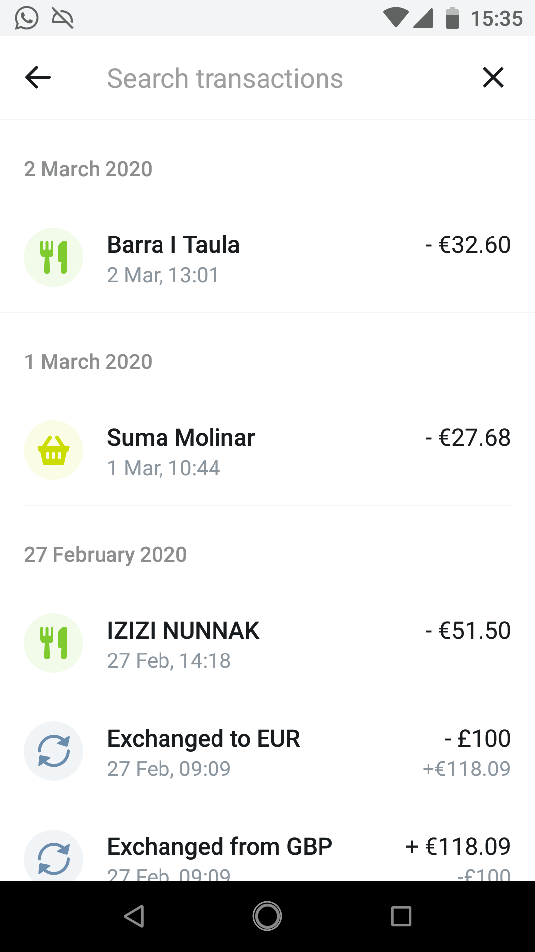
Yes, I have seen some apps doing something somehow similar: they break down the list by date. I've attached an example from Revolut, one of those "neobanks" in the UK. I rather not do that for now (the "keep it simple" thing) but it is definitely a possibility. I would not use collapsable headings here though: they raise all the questions you talk about below regarding what to show and what to collapse :) So my advice would be: keep things as simple as you possible can for now and add other stuff as it becomes (and only if ever becomes) necessary.
Finally, if we do the navigation above, we need to have a plan as to
what is expanded by default. IMO this would depend on how we get to this
dialog:
a) from payment/withdraw: pending expanded if we
are pending. However, if the pending concludes
and we still show the snackbar/notification,
move it to "today's transactions"?
[Disadvantage: a bit of flicker/reordering on
the screen, but at least IF the user clicks
on this dialog on the wrong item just when we
shuffle, nothing actually bad happens.]
b) If user clicked on the 'incoming/outgoing'
pending operations in the balance, we expand
'pending' immediately.
c) If the user clicked on the *balance* of this
currency, we keep 'pending' collapsed and only
expand today's transactions.
WDYT?
-Christian